Brand Identity · Logo Design
logofolio.
A collection of brand identities crafted across industries — each mark built to communicate character, command attention, and hold meaning at every scale.

15
Logos Designed
6+
Industries
3yr
Span
100%
Custom Marks
identity
·
mark
·
symbol
·
wordmark
·
identity
·
mark
·
symbol
·
wordmark
·
01 — Work
Every mark, full frame.
01 — Agriculture
Aquafresh
Liquid Fertilizers
A water droplet fused with a sprouting leaf builds the mark — communicating growth, purity, and liquid nutrition in a single symbol. The blue-to-green gradient reinforces the brand's core promise: water that feeds. A companion lockup pairs the icon with a clean wordmark for packaging and print.
02 — Technology
NFT
AI Technologies Limited · Blockchain
Circuit board traces etched directly into the letterforms turn the three-letter acronym into a visual metaphor for the technology itself. Gold on near-black signals premium positioning in a saturated Web3 space — confident without being loud. The mark works as both a standalone badge and a full lockup.
03 — SaaS
Rankwatch
Online SEO Software
A dual-bar chart icon enclosed in a green circle captures the idea of ranking movement — upward momentum and measurement at a glance. The mark is optimised for small UI contexts: favicon, app icon, browser tab. Clean wordmark typography ensures the brand reads legibly across dark and light product surfaces.
04 — Analytics
Kockpit
Business Analytics Software
An open white ring — the letter O — doubles as a viewport or cockpit window, reinforcing the idea of a single pane of glass through which you run your business. The vivid sky-blue background projects confidence and clarity. The mark is deliberately minimal so it scales without friction across dashboard UI and marketing collateral.
05 — Community
JS Developers
Developer Community · Live Coding
A microphone icon inside a rounded-rectangle badge — the visual language of live streaming — anchors the brand immediately in audio-visual content. The purple-to-violet palette signals creativity and technical depth. A red "Live" pill adds urgency and positions the community around real-time engagement rather than static content.
06 — Research
BIO Info+
Bioinformatics Journal
A DNA double helix enclosed in code brackets merges biology and computation — the exact intersection this journal occupies. Navy and green distinguish the structural from the organic, while the plus sign appended to "Info" signals a richer, expanded knowledge base. The mark communicates scientific rigour without sacrificing approachability.
07 — Real Estate
GD Korp
Global Real Estate Solutions
A landscape scene — mountains, sun, sky — is nested inside a bold G monogram, transforming an initial into a world. The circular containment gives the mark a badge quality suited to property signage, hoardings, and app icons. The earthy coral and midnight navy palette communicates ambition grounded in substance.
08 — Lifestyle
Life-N-All
Fashion · Lifestyle Blog
A flowing script wordmark in magenta-to-purple gradient captures the spontaneous, personal energy of a lifestyle blog. The baseline underline grounds the mark while the casual letterform rhythm signals warmth and accessibility. The gradient transitions reinforce the brand's breadth — fashion, beauty, culture — without needing illustration to say it.
09 — IT Services
Web IQ
Complete IT Solutions
A hexagonal frame — echoing the structural precision of code and engineering — houses a globe mark, anchoring the brand in worldwide digital connectivity. The purple-to-indigo palette bridges creativity and technical authority. The mark reads at icon size without losing structure, making it equally effective as a favicon or a large-format signage element.
10 — Research
Aucto Research
Data Analytics · IT Solutions
Dispersing particle dots off the final letterform suggest data in motion — insights flowing outward from a central intelligence. The teal-to-blue gradient background gives the identity warmth and depth, while white text ensures maximum contrast across digital environments. The companion lockup works as both a primary mark and a sub-brand identifier.
11 — IT Services
Web IQ
Alternate Mark · Intelligent Web
An alternate expression of the Web IQ identity — a brain outline merges with a globe symbol to make the "intelligent web" proposition literal. Drawn in continuous outline style, the mark feels modern and approachable. The teal-green palette shifts the tone toward growth and innovation, differentiating it from the primary hexagonal badge.
12 — IT Services
smeGOweb
Web Services for SMEs
The "GO" in the wordmark is rendered in a pixelated, dot-matrix style — a visual nod to digital acceleration and forward movement. Orange on navy creates a high-contrast, energetic pairing that reads confidently at small sizes. The wordmark construction emphasises momentum, positioning the brand as an active, growth-enabling partner for small businesses online.
13 — Data Analytics
Sqooba
Data Wizard · Analytics Solutions
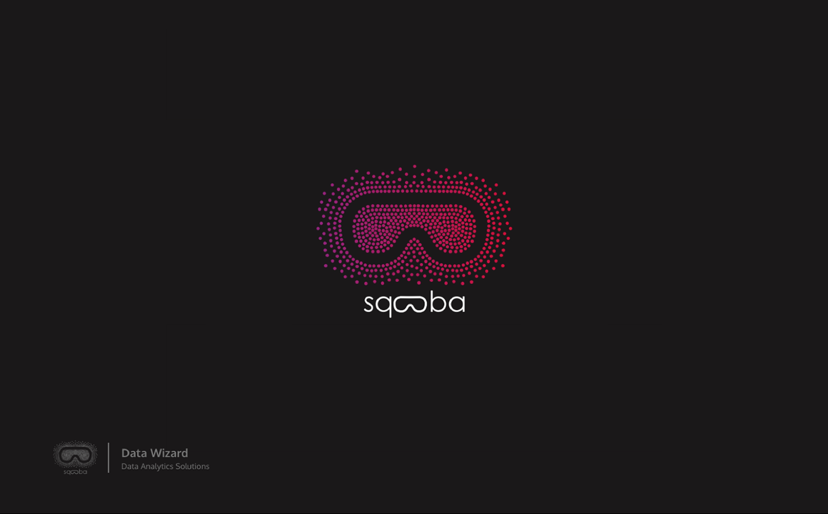
A VR headset silhouette constructed entirely from concentric dot rings turns a data analytics brand into something cinematic. The magenta-to-crimson gradient pulse suggests live data, heat maps, and pattern recognition. On a near-black field it commands attention while communicating technical depth — the mark of a company that sees what others miss.
14 — Natural Products
Cynosure Industries
Natural Oil Conservation
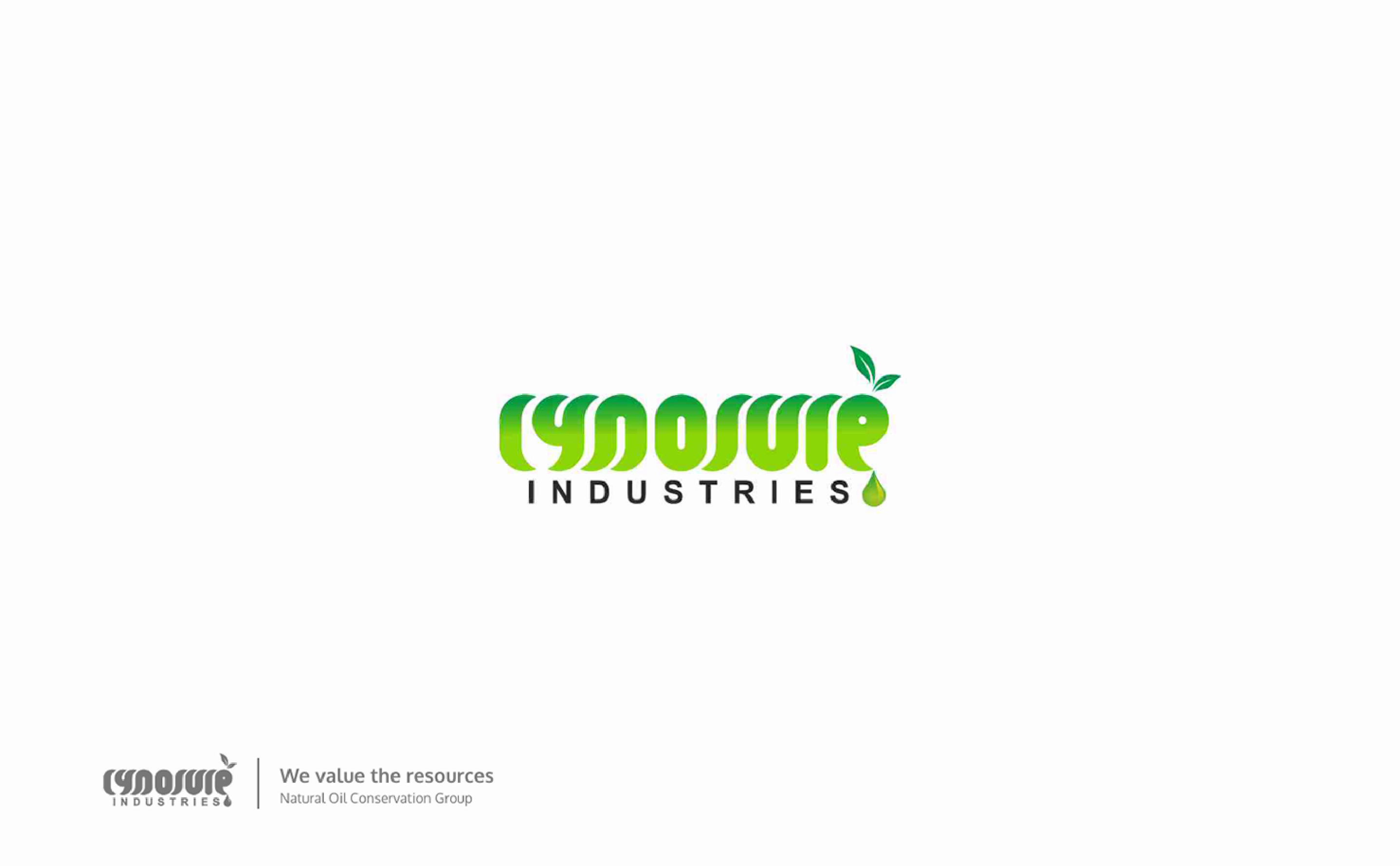
Organic letterforms grown from living green — leaves sprout from the ascenders, a drop falls from the tail — embed the brand's natural origins directly into the typography. The lime-to-forest gradient reinforces freshness and sustainability. The wordmark is paired with "INDUSTRIES" in spaced caps to balance the organic softness of the primary mark with structural authority.
15 — Wellness
Urban YogaHub
Yoga Community · Wellness
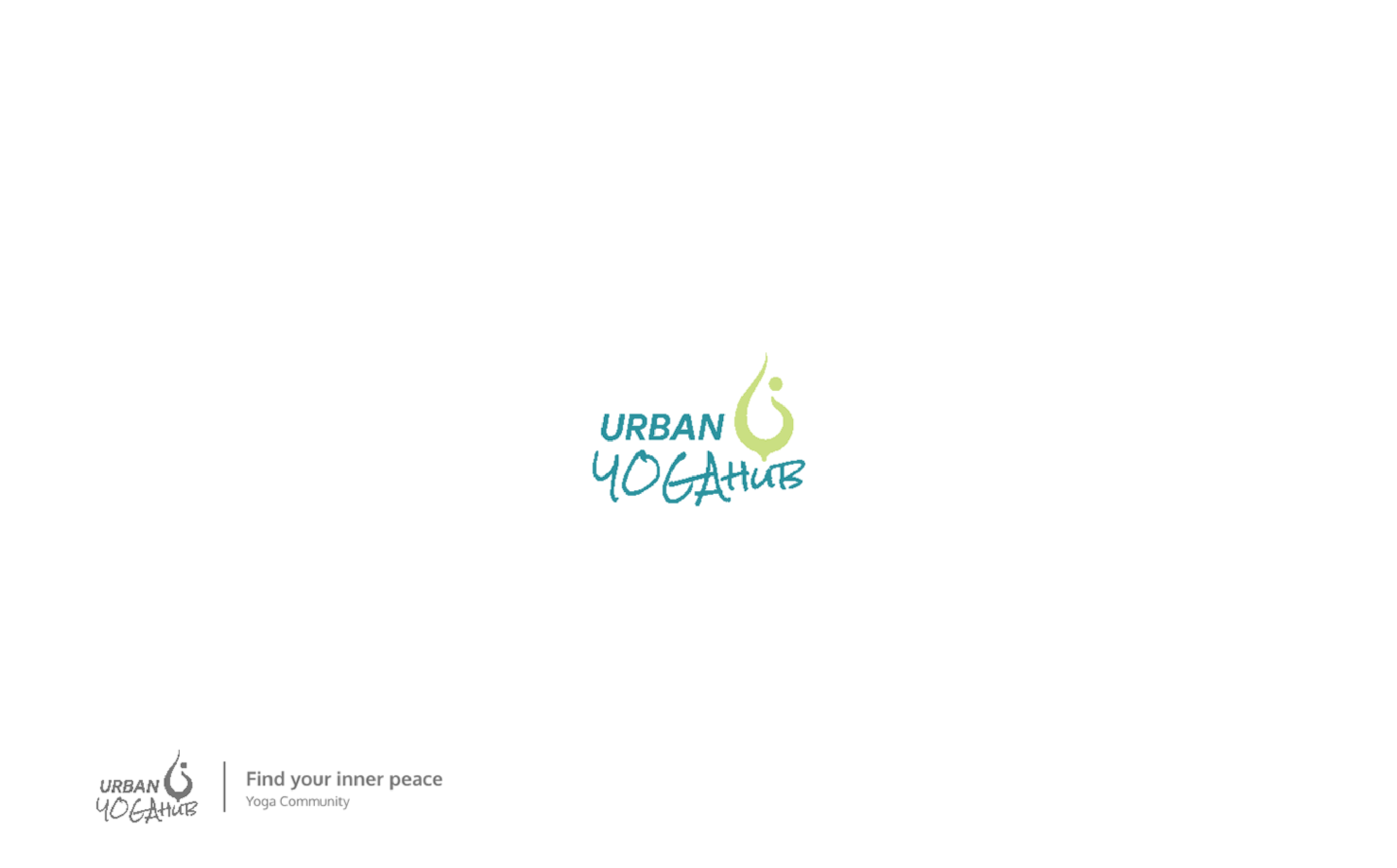
A stylised figure in a yoga pose — arms raised, body balanced — crowns the wordmark as an icon rather than an illustration. The teal and lime-green palette is calm without being clinical, energetic without being aggressive. Script lettering for "YogaHub" contrasts against the geometric "URBAN" to reflect the balance of city life and inner practice the brand promises.
02
02 — Approach
How every mark gets made.
Logo design starts before the sketch. Understanding the brand's voice, audience, and competitive space shapes every decision — from form to colour to scalability.
Discovery
Brief → Research → Direction
Every project starts with a brand audit — who they are, who they compete with, and what gap the identity needs to fill. Three distinct directions are explored before any refinement begins.
Craft
Sketch → Vector → Refine
Marks are drawn analog first, then built in Illustrator at high precision. Grid systems, optical corrections, and spacing ratios are applied at every stage to ensure the mark holds at 16px and 16m.
System
Usage → Colour → Delivery
A logo is a system, not a single file. Primary mark, monogram, reversed variant, clear space rules, and a defined colour palette are delivered alongside every identity.


buddhpriya93@gmail.com · +91-8840-871-715 · buddh.in