Packaging · Surface · Print · Structure
packaging.
Packaging is the first physical conversation a brand has with the world. Each design here begins with the object — its weight, its material, its moment of reveal — and works outward to the label, the colour, and the shelf presence.

Discipline
Packaging Design
Timeline
2022 – 2025
Tools
Illustrator · Photoshop
Output
Print-ready · 3D Mockup
Packaging
02
Brand Systems
13+
Mockup Views
2
Industries
100%
Print-Ready
packaging
·
form
·
surface
·
material
·
unbox
·
print
·
packaging
·
form
·
surface
·
material
·
unbox
·
print
·
Objects that earn their shelf.
01 — Cosmetics · Skincare
Coalit
Premium Skincare · Personal Care
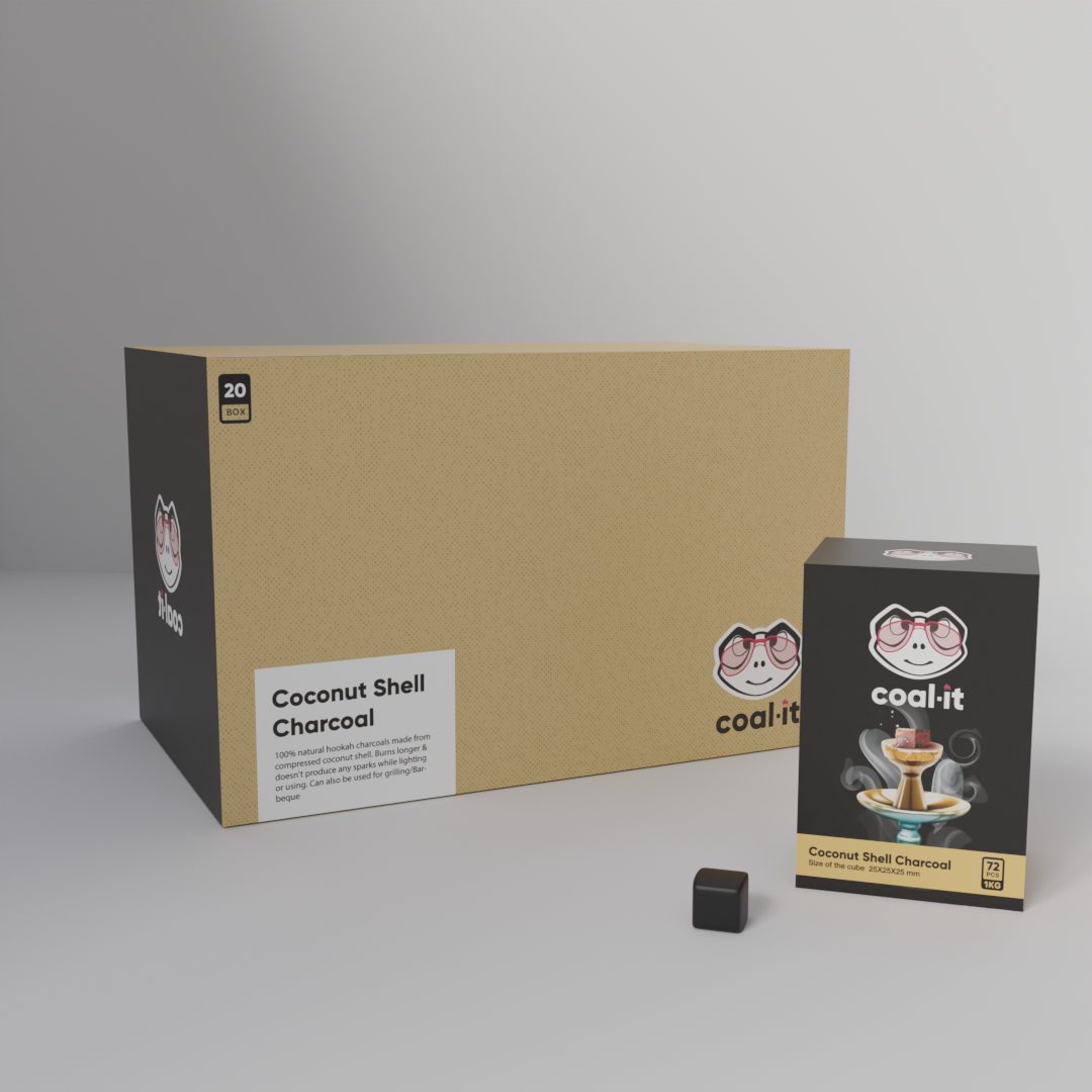
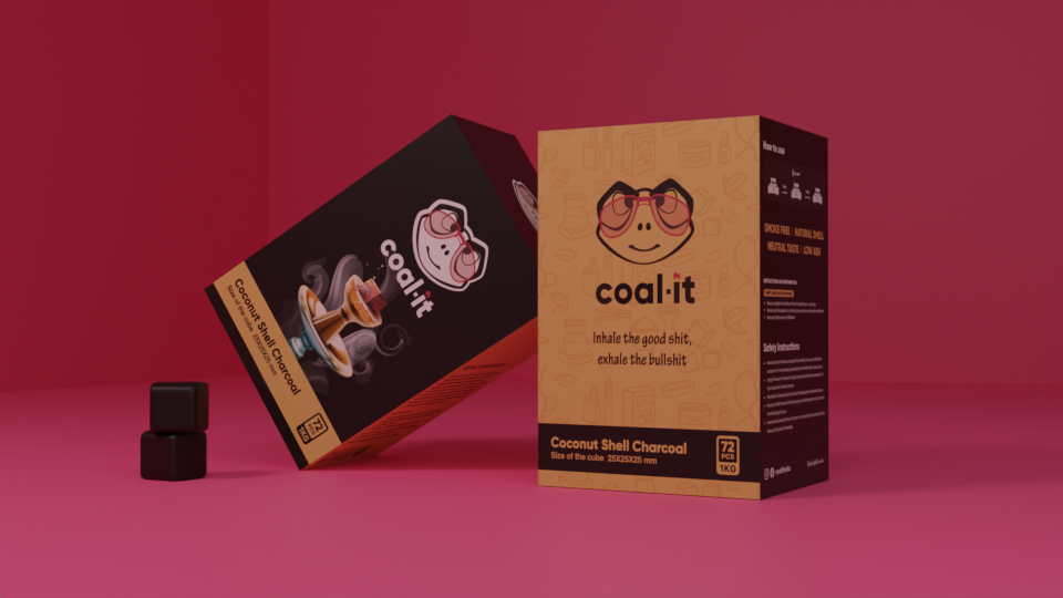
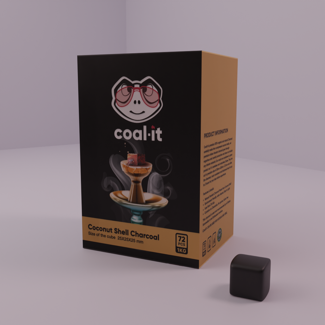
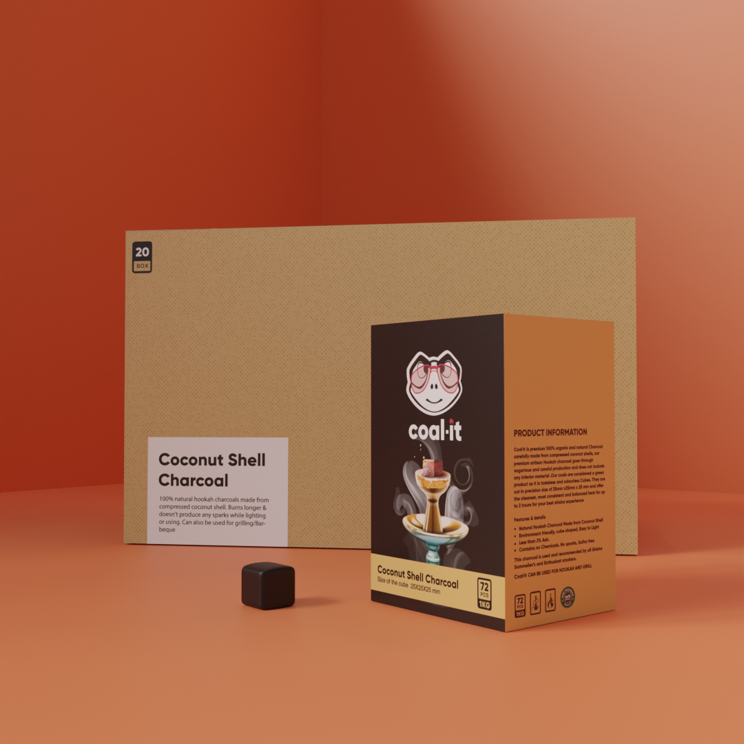
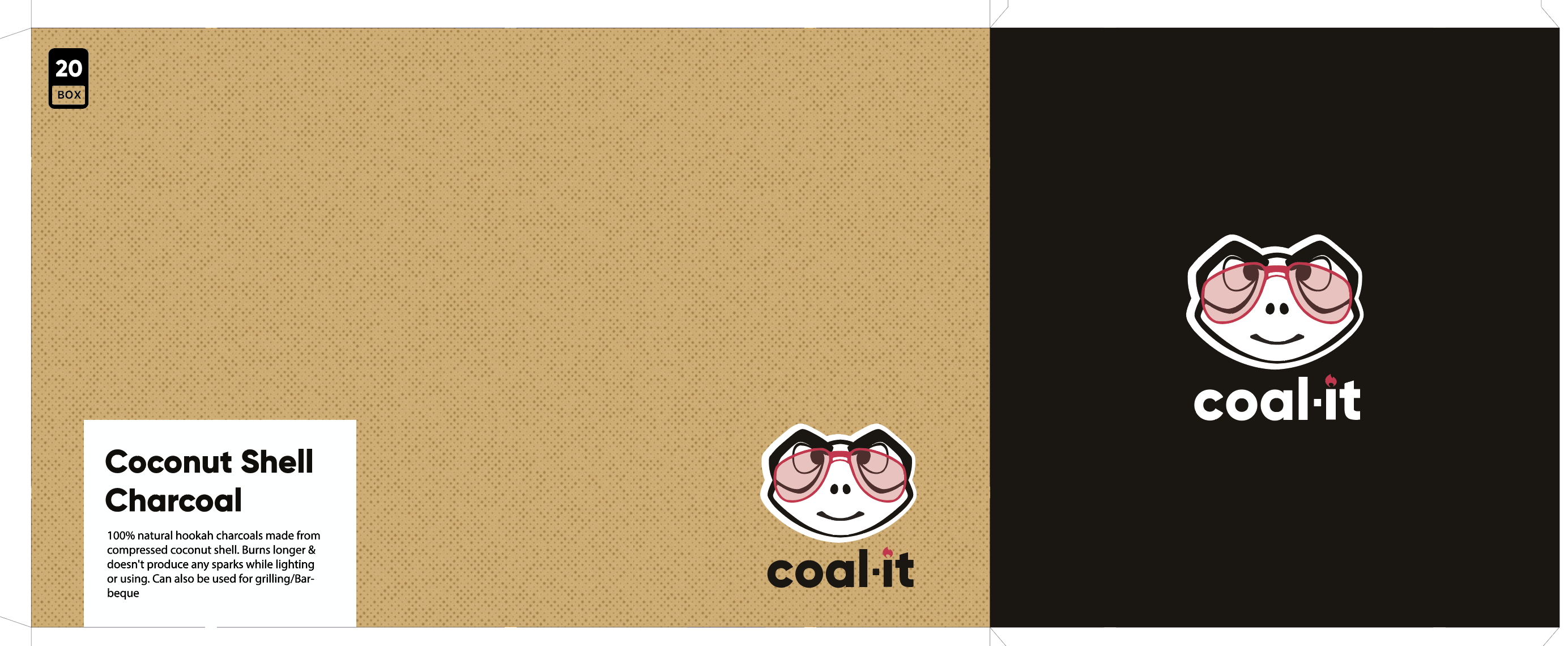
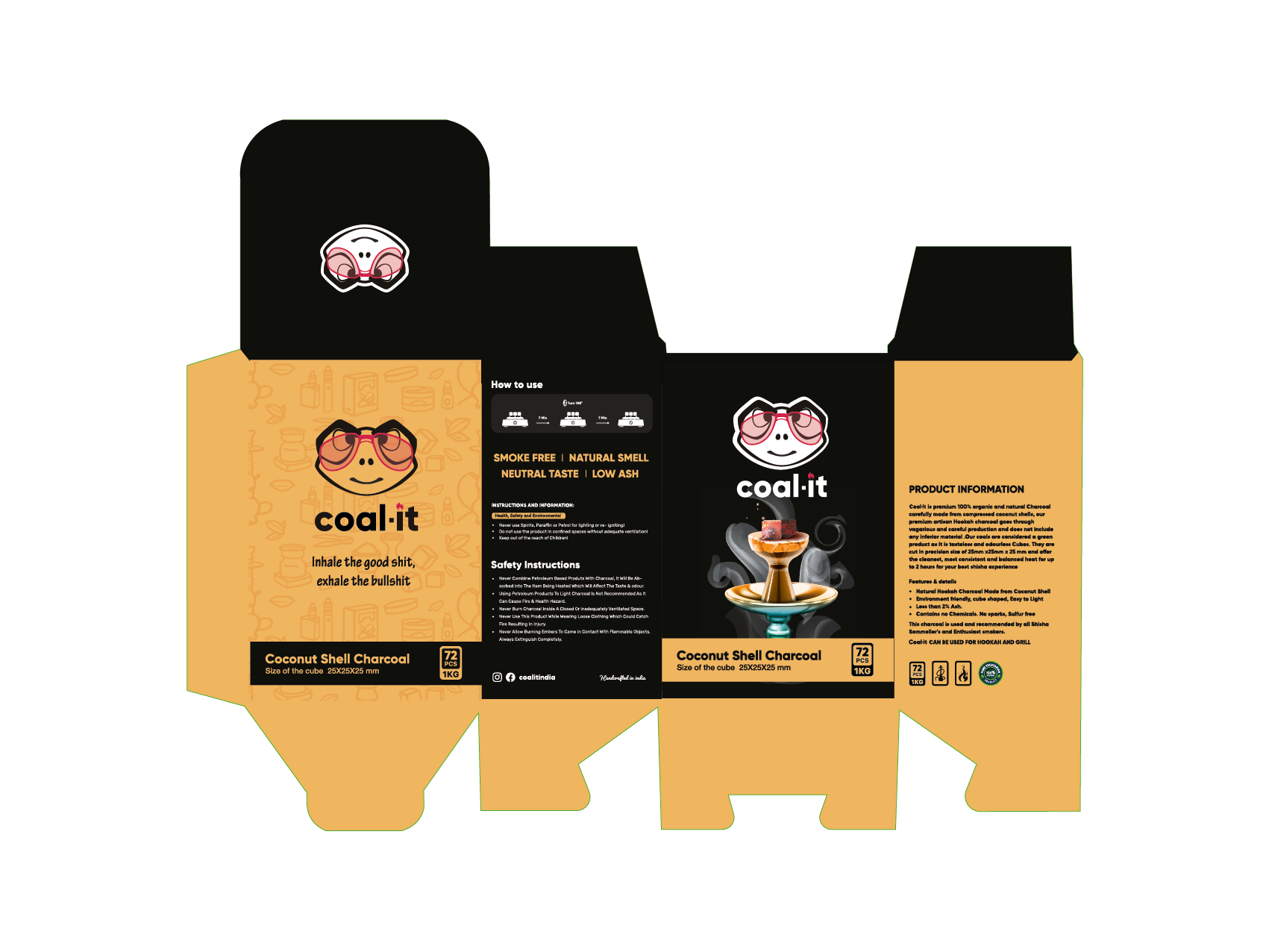
Coalit is a premium skincare line built on restraint — clean formulas, minimal surfaces, and a design language that communicates luxury through what it removes rather than what it adds. The packaging uses a tight achromatic palette, micro-embossed logotype, and structural white packaging to compete at the top end of the personal care shelf. Every label was designed for both clinical retail and direct-to-consumer unboxing.
Label Design Structural Packaging Premium Cosmetics Print-Ready
Coalit — Artboard Composite
01 — Artboard Composite
The Full System
Primary Packaging · All SKUs
The master artboard brings the entire Coalit range into a single view — bottles, tubes, and caps arranged to communicate the coherence of the system. The achromatic palette is deliberate: no colour competes with the formula or the user's bathroom shelf. Logotype is set in a compressed geometric sans at a weight that embosses cleanly at 8pt.
Coalit — White Variant
02 — White Variant
Clean Surface Edition
White · Premium Retail
The white-on-white packaging variant is designed for premium retail environments — spas, clinics, and high-end pharmacy chains — where restraint signals quality. The label is printed in soft-touch matte laminate with a spot-UV logotype that catches light at an angle. Minimal ink coverage keeps print costs low while maintaining a luxury finish.
Coalit — Structural Study
03 — Structural Study
Form & Proportion
Dieline · Structure · Mockup
A study in proportion — cap-to-body ratio, shoulder curve, and label placement are tested here before any surface design is applied. The container geometry was chosen to sit comfortably in one hand while communicating a premium, apothecary-adjacent category positioning. Label height is calculated at 65% of the body height for maximum shelf legibility.
Coalit — Range Configuration
04 — Range Configuration
Six-SKU Range
Full Product Family · Shelf Blocking
Six SKUs arranged to show how the range blocks on shelf — the design system allows each product to stand alone while reading unmistakably as Coalit when grouped. Colour-coded caps at the same height create a consistent top-of-shelf signature visible from three metres. The system was tested against both white and dark shelf backgrounds.
Coalit — Flat Lay
05 — Flat Lay
Editorial Arrangement
E-commerce · Social Media · Press
Flat-lay composition for e-commerce product listings and press kits. Shot against neutral white to ensure the label typesetting and cap detailing read without distraction. This view is also used for direct-to-consumer packaging inserts — a high-quality print of the full range placed inside each mailer box to communicate the breadth of the product family.
Coalit — Detail Reference
06 — Detail Reference
Label & Typography
Print Specification · Colour Profile
A close-up reference capture showing label typography at actual print size. Ingredient copy is set at 6pt in a condensed sans — the minimum legible size for regulatory compliance in cosmetics labelling. The logotype sits at 10pt with 120-unit tracking to maintain the brand's premium open-letter cadence even at small scale. Delivered as CMYK PDF with colour profile embedded.
Coalit · Skincare Packaging System Achromatic · Embossed · Print-Ready
02 — Food · Consumer Goods
Sunita
Artisan Food Products · Consumer Goods
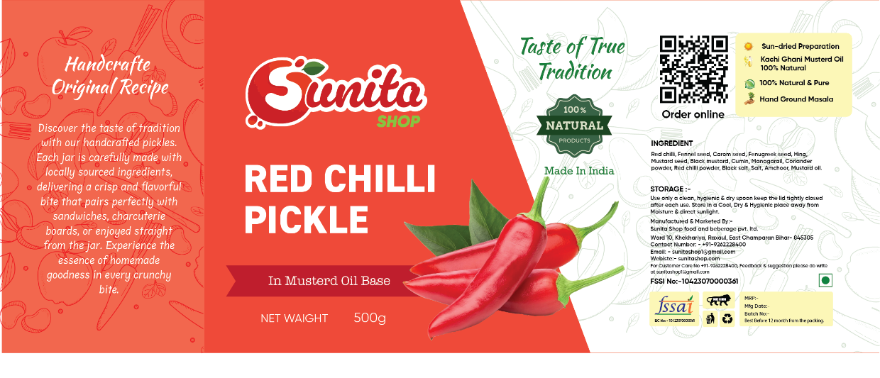
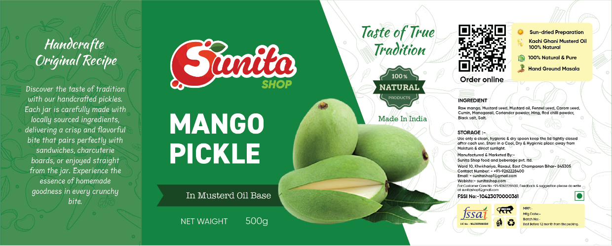
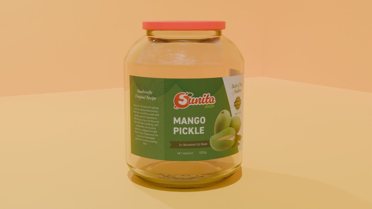
Sunita is an artisan food brand that needed packaging to bridge tradition and contemporary retail. The design language draws on warm earthy tones, hand-crafted texture cues, and a typographic system that feels honest and domestic without sliding into nostalgia. Designed across a full product range — each SKU uses a shared structural grid with a unique accent colour to allow easy range navigation on shelf.
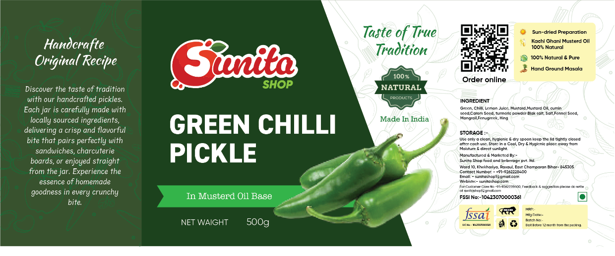
Range Packaging Label System Artisan Food Shelf-Ready
Sunita — Primary Packaging
01 — Primary Packaging
The Hero SKU
Lead Product · Brand Flagship
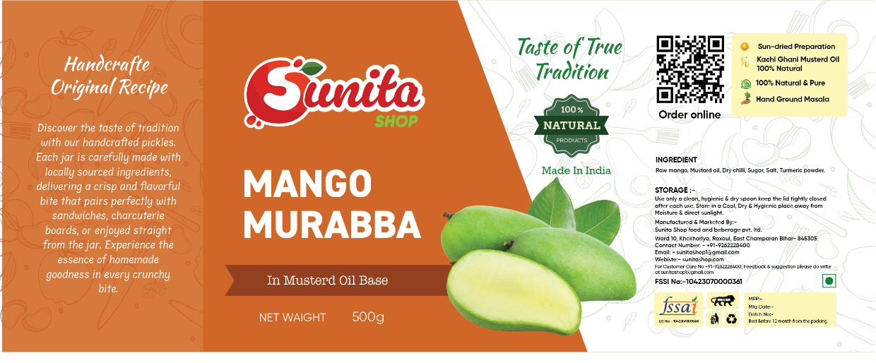
The flagship Sunita product packaging establishes the brand's visual voice — warm kraft texture, a hand-drawn botanical illustration, and a typographic system that balances tradition with legibility. The lead SKU carries the most design complexity: a full-bleed illustration occupies the top third while the lower panel reserves space for ingredient information and the regulatory panel, all kept within a warm cream-and-terracotta palette.
Sunita — SKU Variant B
02 — SKU Variant B
Second Product Line
Shared System · Unique Accent
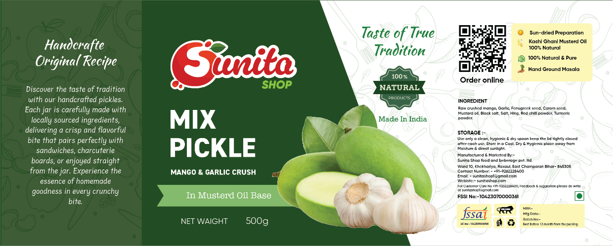
The second SKU uses the same structural template as the hero but introduces a sage-green accent colour to differentiate the product at a glance on shelf. The illustration changes to reflect the product's hero ingredient — the shared logotype and grid lock the two together as a family. Range navigation is built through colour and illustration, not shape, so the system scales to new products without a dieline redesign.
Sunita — SKU Variant C
03 — SKU Variant C
Third Product Line
Amber Accent · Shelf Differentiation
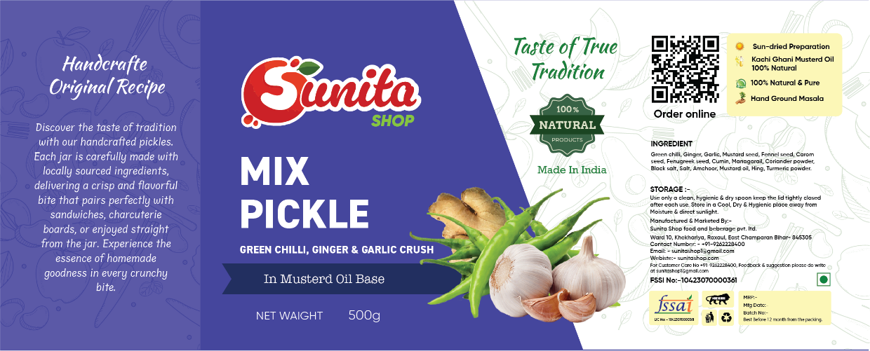
The amber-accented third variant anchors the warm end of the range palette. The illustration treatment shifts from botanical linework to a denser, more textural approach to mirror the product's richer formulation. The amber panel at the bottom creates a distinct colour block that reads from the far end of a retail aisle while remaining coherent with the Sunita brand family when products are shelved together.
Sunita — SKU Variant D
04 — SKU Variant D
Fourth Product Line
Deep Tone · Premium Sub-Range
The fourth product sits at the premium end of the Sunita range, signalled by a deeper, more saturated accent and a reduction in illustration density — restraint as a premium cue. The label shifts from kraft to a lightly coated ivory stock to support the richer print quality the deeper colours require. The product category copy is set in a lighter weight of the range typeface to maintain visual balance as the background darkens.
Sunita — Range Flat Lay
05 — Range Flat Lay
Full Range Together
Cohesion · Shelf-Block · Editorial
The full Sunita range laid out together to demonstrate system cohesion. The colour progression — cream to sage to amber to deep ochre — creates a natural gradient across the shelf. Each product reads individually while the family reads as a single curated system. This view is used in trade presentations, wholesale catalogues, and brand decks to communicate the range's breadth and the design system's scalability to buyers.
Sunita — Label Detail
06 — Label Detail
Typography & Illustration
Print-Ready · CMYK · 300 DPI
A detail view of the label surface — showing the relationship between the hand-drawn botanical illustration and the typographic system at actual print scale. The logotype is set in a custom-weight serif that was selected for warmth and legibility at small sizes. Ingredient lists and nutritional panels are set in a condensed grotesque at 7pt — the minimum for compliant food labelling — with 1.3 leading to maintain readability in the regulatory columns.
Sunita — Context Shot
07 — Context Shot
In Environment
Lifestyle · Brand Story · DTC
The Sunita range shown in its intended environment — a home kitchen counter, natural light, honest surfaces. Packaging design is ultimately a proposition about belonging: does this object feel at home in the space its buyer lives in? The warm kraft and botanical illustration of Sunita passes that test — it sits comfortably alongside ceramics, cutting boards, and everyday kitchen objects without demanding attention or feeling out of place.
Sunita · Food Packaging System Artisan · Range · Shelf-Ready
▭
Cardstock
350gsm coated for clean lithographic print reproduction.
◈
Spot UV
Selective gloss finish to lift logomarks off matte surfaces.
◻
Emboss
Micro-relief on wordmarks to reward close inspection.
○
Foiling
Hot foil on premium SKUs for shelf differentiation.
◌
Kraft
Unbleached natural stock for artisan product lines.
02 02 — Process
How a surface becomes a story.
Packaging design is problem-solving in three dimensions. The label has to work on the shelf, in the hand, and in a photograph. Every decision — material, typography, colour, finish — is stress-tested against all three contexts.
Brief
Category → Consumer → Constraint
Understanding what category the product competes in and what the consumer picks it up for. Retail constraints (shelf height, adjacent SKUs, price point) shape the design language before a single mark is drawn.
Design
Dieline → Typography → Finish
All work begins on the structural dieline so that every design decision accounts for fold lines, bleed, and print registration. Type is set at print size first — never scaled down from a screen version — to catch legibility issues before production.
Production
Proof → Mockup → Handoff
3D mockup renders validate form before print proofs are ordered. Final files are supplied as print-ready PDFs with colour profiles, bleed guides, and a material specification sheet for the printer.
Next Project
teasanti.
buddhpriya93@gmail.com  ·  +91-8840-871-715  ·  buddh.in